Fifteen small interactions a visitor will try exactly once
Your website is often a lead's first contact with your brand. We audited Thesco's sourcing platform so every link, form and image works the first time it's tried.
- Client
- Thesco
- Industry
- Sourcing / Supply chain
- Services
- QA & Testing, Web Development
- Stack
- Next.js, Vercel
Fast, even on a heavy homepage
Lighthouse audit
Thesco's homepage is content- and image-heavy, with large hero and background images. We benchmarked how they load on throttled connections, optimized them, and confirmed the result with a Lighthouse performance audit.
- Image optimization
- Throttled-network benchmark
- Lighthouse audit
Four pages, checked before launch
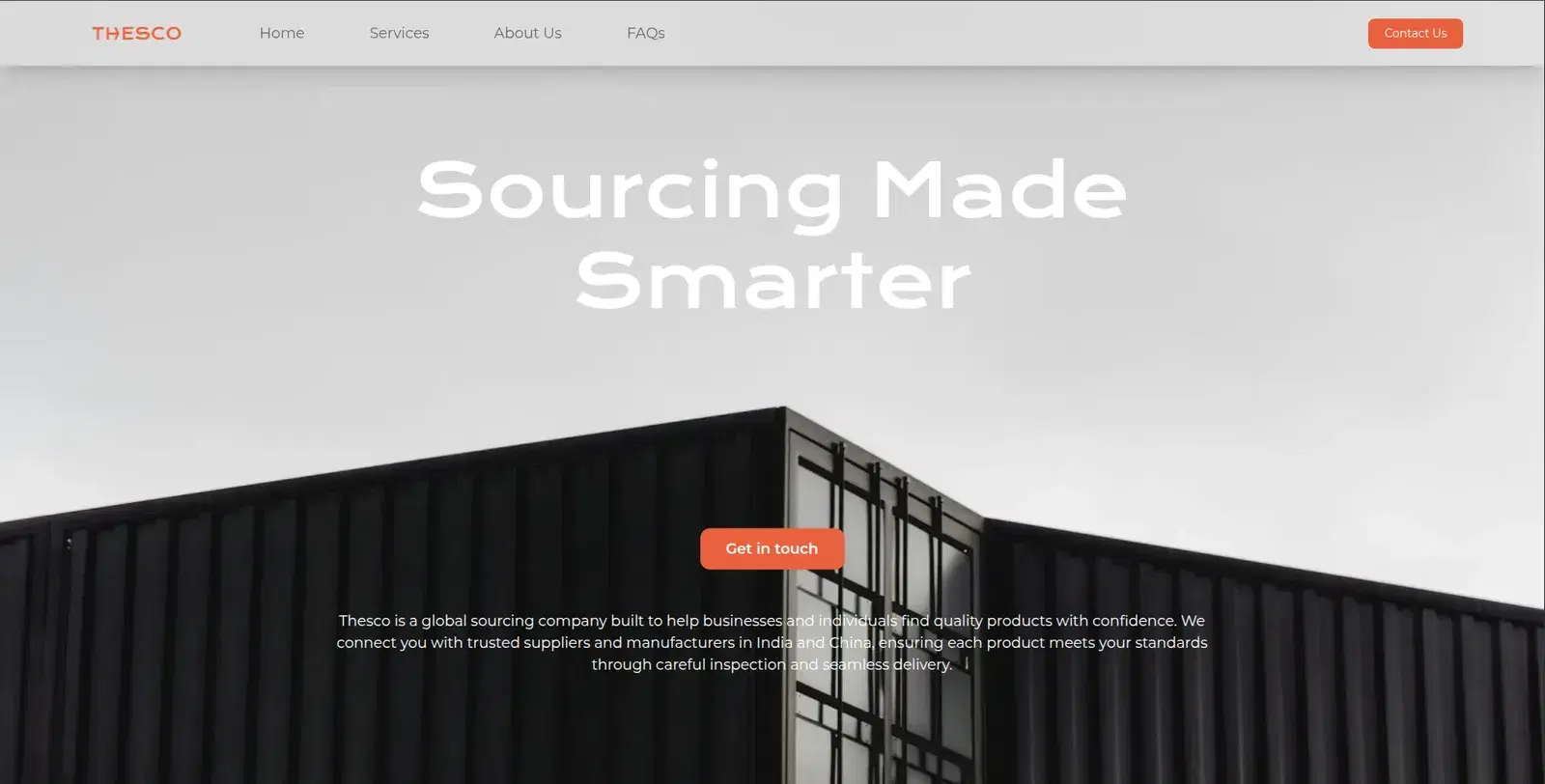
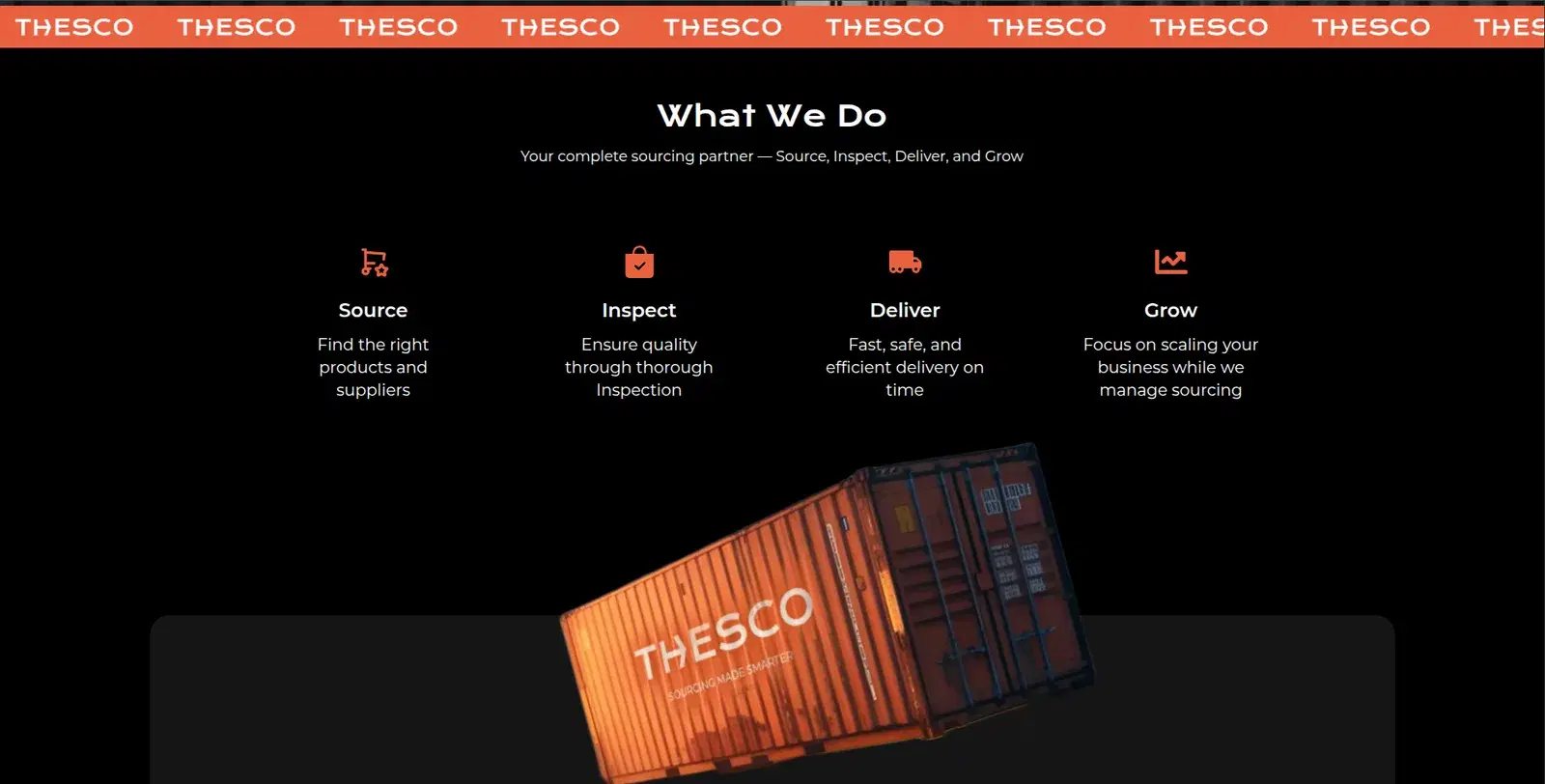
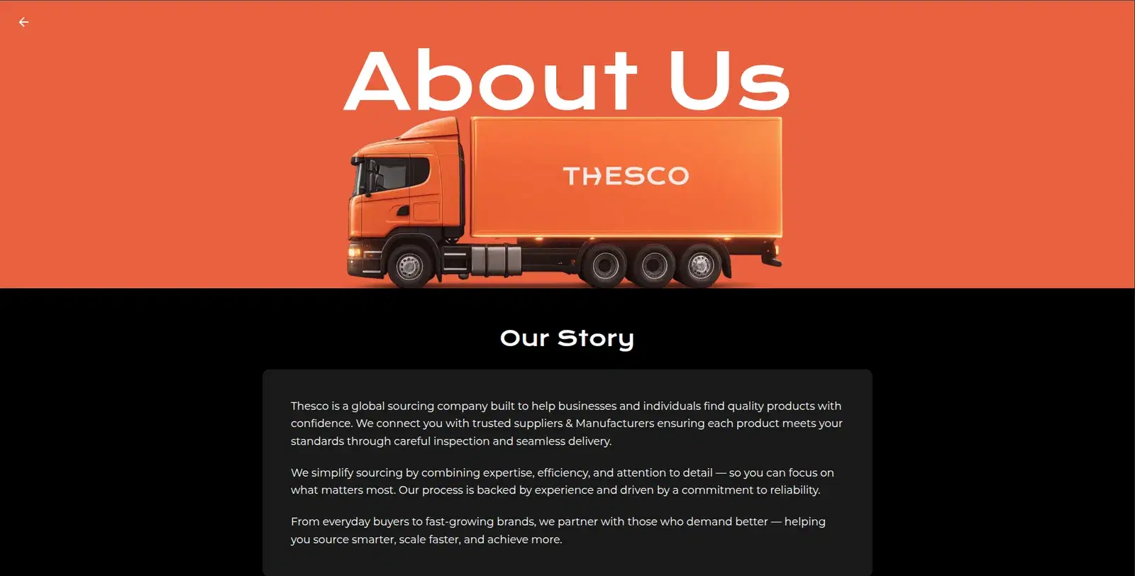
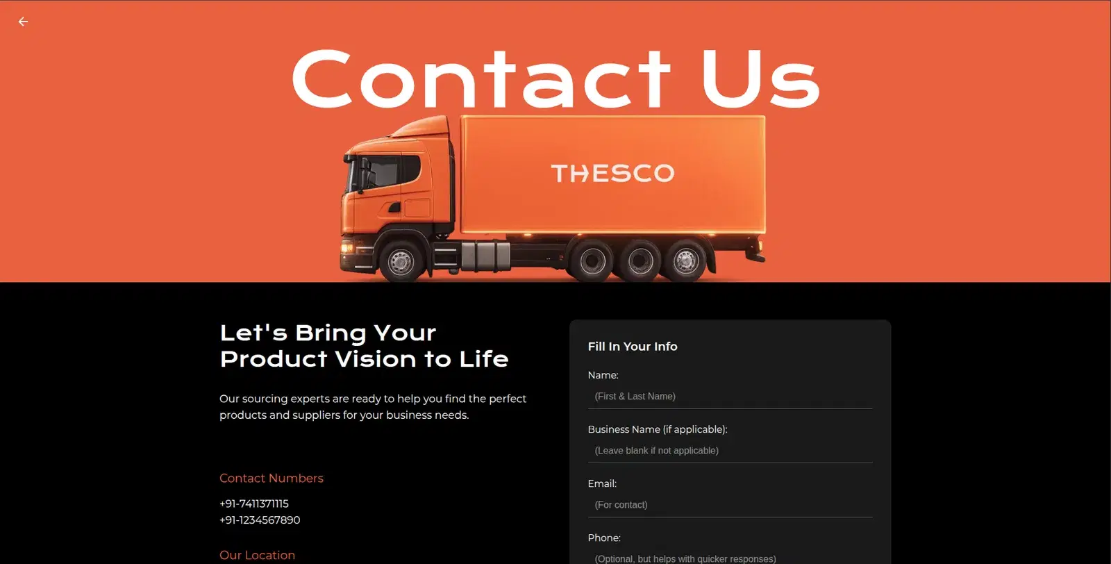
Everything a first-time visitor will try
Navigation
- Every nav link resolves
- In-page anchors land on their sections
- Footer links resolve
- All six "Learn more" links on the offer cards lead somewhere real
- No placeholder destinations left behind
Contact form & details
- Required fields validate before sending
- Successful submission shows a clear confirmation
- Phone numbers are tap-to-call
- Email links open a mail client
Interactive content, speed & accessibility
- FAQ accordion expands and collapses cleanly, every time
- Scrolling banner animation runs smoothly
- Large hero and background images load fast on throttled connections
- Text stays readable (WCAG AA) over every background image
A launch-ready site
Verified navigation, working lead-generation flows, and confirmed performance under real-world network conditions. None of it is exotic, but all of it has to work the first time.
Every test case, step by step
Not every project we take on is a full platform build. Sometimes it's making sure a client's marketing site actually holds up under real-world use before it goes in front of customers. Thesco, a global sourcing company connecting businesses with suppliers in India and China, is one such site: a Next.js build on Vercel with a content-heavy homepage, a multi-step service breakdown, and a contact flow that's meant to turn visitors into leads.
Here's the kind of test pass we run on a site like this: the stuff that's easy to miss in a design review but shows up immediately in real usage.
Navigation & Links
| ID | Test Case | Steps | Expected Result |
|---|---|---|---|
| TC-01 | Primary nav routes correctly | Click Home, Services, About Us, and Contact Us in the header | Each link loads the correct page without a 404 or layout shift |
| TC-02 | In-page anchor navigation | Click "FAQs" in the header | Page scrolls smoothly to the FAQ section anchor, not a hard jump or dead link |
| TC-03 | "Learn more" links resolve | Click "Learn more" under each of the six offer cards (Sourcing, Custom Solutions, Market Research, Quality Assurance, Logistics & Fulfillment, Trend Analysis) | Each leads to a real destination with relevant content, and none point to # or a blank page |
| TC-04 | Footer social icons are live | Click each social icon in the footer | Each opens the correct social profile in a new tab, and none are unlinked placeholders |
| TC-05 | "Terms & Conditions" footer link | Click the Terms & Conditions link in the footer | Loads an actual terms page, not a dead anchor |
Forms & Contact
| ID | Test Case | Steps | Expected Result |
|---|---|---|---|
| TC-06 | Contact form required-field validation | Submit the contact form with empty fields | Form blocks submission and shows clear inline errors for each required field |
| TC-07 | Contact form success state | Fill the form correctly and click Send | User sees a visible confirmation (message or redirect), not just a silent page reload |
| TC-08 | Phone number tap-to-call | On mobile, tap either listed phone number (+91-7411371115 / +91-1234567890) | Device's dialer opens pre-filled with the number |
| TC-09 | Email link behavior | Click the hello@thesco.in email link | Opens the user's default mail client with the address pre-filled |
| TC-10 | Duplicate/placeholder contact numbers | Review both listed phone numbers | Confirm neither is a leftover placeholder (e.g. a template default like +91-1234567890) |
Content & Interactive Elements
| ID | Test Case | Steps | Expected Result |
|---|---|---|---|
| TC-11 | FAQ accordion expand/collapse | Click each of the 5 FAQ questions | Each expands to show its answer independently, and collapses on second click |
| TC-12 | Marquee animation performance | Watch the repeating "Sourcing Made Smarter" scroll banner for 60+ seconds | Animation loops seamlessly with no stutter, layout jump, or memory creep on longer sessions |
| TC-13 | Numbered process sections render in order | Check the "Custom Solutions" (1–6) and "Logistics & Fulfillment" (1–6) numbered lists | Numbers and content stay correctly paired at all breakpoints, with no reflow that separates a number from its heading |
Performance & Assets
| ID | Test Case | Steps | Expected Result |
|---|---|---|---|
| TC-14 | Large background image load time | Load the homepage on a throttled 3G connection and time the hero/background image render | Background image (served at up to 3840px wide) loads progressively or is appropriately compressed, and doesn't block first paint |
| TC-15 | Image srcset correctness |
Inspect served image sizes on mobile vs. desktop viewports | Next.js image optimization serves an appropriately sized asset per device, not the full 3840w image to a phone |
| TC-16 | Lighthouse performance baseline | Run a Lighthouse audit against the homepage | Performance score meets an agreed threshold (e.g. 85+) despite the image-heavy design |
Responsive & Accessibility
| ID | Test Case | Steps | Expected Result |
|---|---|---|---|
| TC-17 | Mobile nav collapse | Resize to a mobile viewport and open the navigation | Menu collapses into an accessible hamburger/drawer pattern, with no horizontal overflow |
| TC-18 | Heading hierarchy | Audit the DOM for h1–h4 usage across the page | Headings follow a logical order for screen readers, with no skipped levels |
| TC-19 | Contrast on background-image sections | Check text contrast on sections layered over bg-container.webp and the ship/container images |
Text meets WCAG AA contrast regardless of what part of the underlying image sits behind it |
Why this matters
A sourcing company's website is often a prospective client's first interaction with the brand, before a single email or call. A broken "Learn more" link or a contact form that fails silently doesn't just look sloppy, it costs a lead. Testing content-heavy marketing sites like this isn't about edge cases; it's about making sure the fifteen small interactions a real visitor will actually try all work exactly once, the first time.
This is the same bar we hold every client site to at Rise Digital India.
Need a pre-launch QA pass on your site before it goes in front of customers? Get in touch with Rise Digital India.
Want a pre-launch QA pass before your site meets real customers?
Rise Digital India · Let's talk
Get in touchMore Case Studies
- Testing in Production: QA Test Cases from Building DIAREV
- Anatomy of a Production Outage: Debugging DIAREV's Multi-Cause Incident
- Haat: Building a Multi-Vendor Marketplace Shoppers Can Trust
- Angeethi: A Restaurant Operating System from Table QR to GST Bill
- NestPG: One Platform for Finding a PG and Running One
- See all case studies